Why repeated letters look stamped
A doubled letter is where a handwriting font gives itself away: two identical shapes side by side read as a stamp, not a hand. A second version of the letter is enough to break that.
How many to draw
- Two versions of the letters that repeat most: in English e, o, l, t, s, a; in Hebrew ו, י, ה, ל, מ, ר.
- Three for the very commonest, if you have the patience.
- Up to 4 for any character. More rarely shows: few words repeat a letter that often.
Choose which letters get them
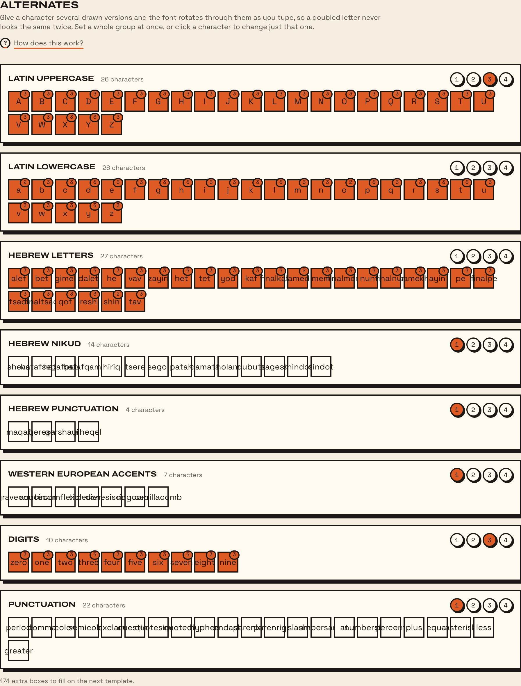
In the Alternates tab, each group of characters has buttons from 1 to 4: how many versions every character in the group gets. Click a single character to change just that one; each click adds a version, and after 4 it goes back to one. Under the groups, Fonterie counts the extra boxes this adds to the next sheet.
Where to draw them
- On a sheet: print one with Only what is still missing ticked, and it asks for exactly the versions not yet drawn.
- From a photo: a letter the font already has is kept as another version of it, so one page of writing fills a lot of alternates. See the photo guide.
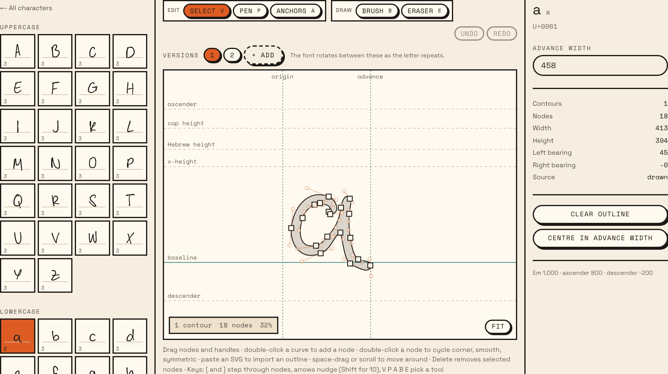
- By hand: open a character in the Characters tab. Its versions are listed under Versions; + Add adds one.
How they rotate
The font cycles through a letter’s versions as the text runs on, so the same letter twice in a row is never the same drawing. This uses the OpenType feature called contextual alternates (calt), which is on by default: you don’t have to do anything in the app.
The export dialog shows how many Characters with alternates the font has. In Microsoft Word, turn on “Use Contextual Alternates” under Font, then Advanced, if the versions don’t change.